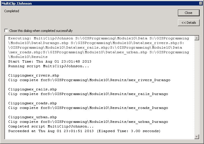
Sunday, December 8, 2013

Project 5: Presentation

Calculating Standing Timber Values

Below you'll find the links to my final presentation and abstract on calculating standing timber values, enjoy.

Abstract

Presentation

Tuesday, November 26, 2013

Project 4: Forestry - Report Week

Forestry Poster


This week we finished up our forestry project by bringing together our preparation and analysis into one poster. This poster sums up a pro-clearcutting view of forestry management from the economic, ecological and aesthetic viewpoints.

Wednesday, November 20, 2013

Project 4: Forestry - Analyze Week

Impact Summaries

Ecological Summary:

The greatest ecological impact of clear-cut logging in North America occurred at the turn of the nineteenth century. Since then, foresters have gained a greater understanding of reforestation, best management practices and wildlife habitats. With proper forest management, clear-cutting is now an integral part of a forest’s biodiversity.

Economic Summary:

Clear-cut logging is the most financially efficient method of forest management because the greatest volume of wood is harvested at one time. Clear-cutting also requires fewer logging roads because it relies mainly on a cable logging system for transporting timber from the stump to the loading yard. Cleared sites are also less expensive to prepare for planting seedlings which regenerate faster than natural regeneration.

Aesthetic Summary:

The greatest objective to clear-cutting is the impact it has visually. No one wants to drive through a forest and see bald spots on the side of a mountain. But the visual impact of clear-cut logging can be predicted and reduced with the use of GIS. Knowing the view shed of public roads can help forest managers select future clear-cuts with the least visual impact. 

Monday, November 18, 2013

Project 4: Forestry - Prepare Week

Recent Clearcuts

This week we determined the aesthetic impact of clearcuts along major roadways in a 1,400-hectare woodlot in the Acadian-New England forest.


This was accomplished by identifying clearcuts no older than 5 years that shared a boundary with a major road.

Frequency Distribution


A frequency distribution of shared lengths between major roads and the clearcuts was created to show the distribution of clearcut distances (in kilometers) along the major roads. 

Aesthetic Impact


A view shed was created and reclassified according to the areas of the woodlot that are visible from a major road. The viewshed was combined with the previously identified clearcuts and used to calculate the total area of visible clearcuts.

Wednesday, November 13, 2013

Lab 10: Supervised Classification

Supervised Classification


This week we performed a supervised classification using tools in ERDAS Imagine. The final layout was created in ArcMap with the resulting Land Cover and Distance Images. The Distance Image is used to identify the brighter pixels that are more likely to have the wrong classification in the output image. Samples of spectral signatures were collected of known features and then used to create the Eight classes shown in the map. When applied properly, the supervised classification method produces a more accurate land cover map than the unsupervised method.


Wednesday, November 6, 2013

Lab 9: Unsupervised Classification

Unsupervised Classification


This week we performed an unsupervised classification using tools in both ArcMap and ERDAS Imagine. The image in this map is the result of an unsupervised classification in ERDAS Imagine. The final layout was created in ArcMap. Classifying this image provides a relatively accurate means of calculating surface areas. Classified images can also be used to extract vector data and create layers for features such as, buildings, roads and even telephone poles. 

Monday, November 4, 2013

Project 3: Web Applications - Report Week

A Visitor's Walking Tour of Downtown


This week we continued with web applications and finished up the final touches to our story maps. I made a few configuration changes to the template to "own my map" and dress it up some. My story map is a walking tour for visitors to the downtown area of Hinesville, Georgia. My goal with this assignment was to bring to life the history that is still evident downtown. In my humble opinion, I've succeeded in barely scratching the surface. As brief as it may seem, it is my pleasure to share my journey with you. I hope to use this map to demonstrate one of the benefits of GIS among the local governing authorities.
My Story Map

Wednesday, October 30, 2013

Lab 8: Thermal & Multispectral Analysis

Wildfire Hotspots

This week we used ArcMap and EDRAS Imagine to create composite multispectral images. Then we adjusted the images band combinations and symbology in order to identify features in the image. In this image of the Ecuador Coast, I adjusted the bands to contrast wildfire hotspots. In the true color image, two of the five hotspots had no smoke plume visible and may have gone unnoticed with out the aid of thermal imagery.

Tuesday, October 29, 2013

Project 3: Web Applications - Analyze Week

"Working" Tour Map


This week we completed a "working" version of our story map using a web map template from Esri. My map is a walking tour of downtown Hinesville, Georgia. The tour highlights buildings and monuments of historic significance. You can check out my progress here.

Thursday, October 24, 2013

Project 3: Web Applications - Prepare Week

Story Map


This week we started on our third project where we learned about story maps. When my wife asked me what a story map was, I jokingly replied, "it's a map, that tells...a story". Yeah, she rolled her eyes at me. According to Esri's website, a story map is a web map that incorporates text, multimedia and interactive functions to inform, educate, entertain and inspire people about a wide variety of topics. For this project I will create a walking tour of the downtown area of Hinesville, Georgia. The map will highlight points of interest within walking distance of the courthouse square. Check out this story map of the recent flood in Fort Collins, Colorado.

Wednesday, October 23, 2013

Lab 7: Multispectral Analysis

Water Feature

This week we used clues to identify and locate examples of different features within EDRAS Imagine. In this map, identified the feature in the area of interest as water. I chose a color band combination of Red - Layer 6, Green - Layer  5 and Blue - Layer 3 to contrast the water against the other features in the image.

 Snow Feature

In this map, I used multiple views to identify the mystery feature. From the clues led me to this snow capped area where I chose a false color band combination to contrast the snow from surrounding vegetation.

 Variations in Water

And finally, in this map we were instructed to select a color band combination that clearly shows variations in water. I determined the best color band combination to show these features is Red - Layer 3, Green - Layer 2 and Blue - Layer 1.

Wednesday, October 16, 2013

Lab 6: Spatial Enhancement

Image Enhancement
This map was created in ArcMap with an image that was enhanced in ERDAS Imagine. The original image was striped with diagonal black lines that narrowed from left to right. Using the tools available in ERDAS Imagine, I was able to reduce the striping while retaining most of the detail in the original image.

Tuesday, October 15, 2013

Project 2: Bonus Assignment

HURREVAC


HURREVAC version 1.3.3, released on August 28, 2013, is a free computer-based program used to assist government emergency managers with hurricane evacuation decisions for their area. The program originated in 1987 as ‘Decide’, with the purpose of computing evacuation decision times for South Carolina. HURREVAC routinely checks for updates from the National Hurricane Center and displays this information in the programs interactive interface. Pre-determined clearance times for the user’s local area are automatically checked against a storms projected path. If the user’s area falls within the storms cone of probability, HURREVAC will prompt the emergency manager and notify them of the danger. The user can easily print maps from the program and use them in planning meetings. This software can be a very useful tool for local governments that do not have a GIS staff. You can obtain more information on HURREVAC at www.hurrevac.com

Project 2: Network Analyst - Report Week

Presentation of shelter locations to public

Hurricane Amber is expected to make landfall in the Tampa area on the evening of Thursday October 17, 2013. The National Weather Service is predicting heavy rain, along with a storm surge which may result in 5.5 ft of standing water in the South Tampa area. The Tampa Bay Blvd, Middleton HS and Oak Park storm shelters will be open before, during and after the storm. It is important to inform the public which shelter is closest to their location and what better way to so than a map. An evacuation service area map was designed in Adobe Illustrator including a map created in ArcMap. The evacuation service area polygons were built utilizing the Network Analyst extension. Network Analyst created each polygon by determining those routes that required the least amount of time to get to one of three storm shelters. The map also includes some helpful reminders for preparing for the storm. This map can easily be distributed to local and national television news agencies, as well as print media and the internet.  Please note that neither shelter capacity nor population density was considered for this study. As a result, overcrowding may become an issue at one or more of the shelters.


Tuesday, October 8, 2013

Project 2: Network Analyst - Analyze Week

Evacuation Service Areas and Emergency Routes

This week we focused on the Network Analyst extension of ArcGIS. Using point features and the roads feature class we prepared last week, I created two routes to aid in the evacuation of a hospital and three routes to aid in the delivery of emergency supplies to storm shelters. The road network and shelter feature points were also used to create Evacuation Service Areas. This data can be used to create information pamphlets for the public before a storm and driving directions for emergency workers before, during and after a storm.

Wednesday, October 2, 2013

Lab 5a: Intro to ERDAS Imagine and Digital Data 1

Classified Image of Forested Land in Washington State

This map was created from a subset of Landsat Thematic Mapper (TM) imagery of forested land in Washington State. The TM imagery was processed using EDRAS Imagine where an Area field was added to the image attributes in order to calculate the total acreage of each colorband. The final layout was created in ArcMap.

Tuesday, October 1, 2013

Project 2: Network Analyst – Prepare Week

Hurricane Evacuation Route Planning: Tampa, FL 

This week we prepared data for use with the Network Analyst extension of ArcGIS. This base map shows classified DEM polygons which were used to create a flood zone feature class (not pictured). The flood zone feature class was then used to identify which roads are likely to be flooded in the event of a hurricane impact. Knowing which roads are more likely to be affected are important when creating evacuation routes. This information can then be distributed to residents and local authorities.

Wednesday, September 25, 2013

Lab 4: Ground Truthing and Accuracy Assessment

Ground Truthing and Accuracy Assessment

This week I conducted a ground truthing and accuracy assessment of land use/land cover map I produced last week in lab 3. I created a point feature class to capture 30 samples in a stratified random pattern. Then I verified the accuracy of the assigned land use/land classification at each point using Google Street View. Those points that were accurate are marked with a green dot, and those points that were not accurate are marked with a red dot. The overall accuracy was calculated by dividing the total number of correct samples by the total number of samples.

Wednesday, September 18, 2013

Lab 3: Land Use/Land Cover Classification Mapping

Land Use/Land Cover Classification

This is a land use/land cover classification map classified to level 2 of 4 of the USGS Standard Land Use/Land Cover Classification System. This map was created by systematically digitizing all areas of an aerial photograph according its land cover and land use. The only resource for the classification was the photograph itself.

Wednesday, September 11, 2013

Project 1: Analyze Week

OLS Results


This is a screen shot of the Ordinary Least Squares (OLS) results window after performing what Esri calls "The Six Checks". The checks are necessary to determine which explanatory/independent variables are unneeded in the model.

Standard Residuals Results

This map shows the standard residuals results of a regression model used to predict meth lab locations in  West Virginia. The model predicted fewer meth labs in areas where the standard deviation is less than -0.5 than actually are there. In areas where the standard deviation is greater than 0.5, the model predicted there would be more.  

Monday, September 9, 2013

Visual Interpretation

Identifying Tone and Texture

This map was created to show the differences between tone and texture in aerial photography. Tone ranges from Very Light to Very Dark while Texture ranges from Very Fine to Very Coarse.

Identifying Features

This map was created as an example of how features can be identified based on four different visual attributes; Shape & Size, Shadows, Pattern and Association.


Saturday, September 7, 2013

Project 1: Prepare Week

Basemap of Study Area


This week I prepared to study whether or not socio-economic factors can be used to determine the most likely locations of future methamphetamine labs. This is a basemap of the study area around Charleston, WV where I will be conducting my analysis.

Friday, August 9, 2013

Module 11: Sharing Tools

Random Buffer Tool and Result

This is a screenshot of custom tool that can be easily shared between users. The tool incorporates a Python script that was imported into the tool. The tool prompts the user to select their own parameters in the dialog through help tips. Even if the user has no knowledge of Python scripting, a well designed geoprocessing tool can increase the users productivity.

Thursday, August 8, 2013

Final Project: Presentation

Locating a Home in Duval County, Florida

Below you will find links to my final project presentation and slide-by-slide summary, Enjoy.

Presented in ArcGIS Explorer Online


Friday, August 2, 2013

Module 10: Creating Custom Tools

Part 2 Screenshot: Multi Clip Custom Script Tool 

This custom script tool was created in using the Add Script Wizard in ArcMap. A script tool allows a user with no knowledge of Python to perform geoprocessing tasks by simply entering tool parameters using built in validation and error-checking. 

Part 3 Screenshot: Multi Clip Messages

This is a screenshot of the results window after the custom script tool completed its tasks. Script tools enable Python to write messages to the results window during a geoprocessing task informing the user of the tools progress. 

Friday, July 26, 2013

Participation 2

Locating Opportunities for Outdoor Action and Adventure Recreation and Tourism in the Western Cape: A GIS Application


In his journal article, Johannes H. Van Der Merwe demonstrates how GIS is used to create a model for entrepreneurial and regulatory planning. The subject area for the article is the Western Cape Province of South Africa, “a premier tourism destination”. Recreation, marketing and tourist preference data was collected and given spatial attributes. The data was then analyzed by creating a weighted overlay map of the area. Planners and entrepreneurs are now able to use the results of the analysis to help them make better decisions for developing future recreation and ecotourisim attractions.

Reference:

VAN DER MERWE, J. H. (2012). LOCATING OPPORTUNITIES FOR OUTDOOR ACTION AND ADVENTURE RECREATION AND TOURISM IN THE WESTERN CAPE: A GIS APPLICATION. South African Journal For Research in Sport, Physical Education & Recreation (SAJR SPER). 34(2). 197-214. doi: 20121127. Retrieved from http://ehis.ebscohost.com.ezproxy.lib.uwf.edu/ehost/detail?sid=3ca29466-6ea6-452e-a3c7-b07ec8567cfa%40sessionmgr4&vid=8&hid=6&bdata=JnNpdGU9ZWhvc3QtbGl2ZQ%3d%3d#db=s3h&AN=83582233

Module 9: Debugging and Errors

Part 1 Result

This is a screenshot of the PythonWin Interactive Window after running the first script I successfully debugged using the methods we learned in this weeks lab. The script displays the names of the airports in the airport shapefile for the State of Alaska. 

 Part 2 Result

This is a screenshot of the PythonWin Interactive Window after running the second script I successfully debugged using the methods we learned in this weeks lab. The script displays the name of each data frame along with the name of each layer in an ArcMap document.

Friday, July 19, 2013

Module 7: Geometry and Rasters

Text File Result

This is a screenshot of a text file created by a Python script. The script writes the Object ID of the feature, the vertex number, the XY coordinates of the vertex, and the feature name for each vertex in a shapefile using the Search Cursor function in Python.

Final Raster Result

 
This is a screenshot of the ArcMap desktop window showing the result of a Python script. The script creates a temporary land cover raster where the forest land cover was reclassified, and four temporary elevation rasters for minimum and maximum slopes and aspects. The five temporary rasters are then combined into the Final Raster seen here.

Thursday, July 18, 2013

Urban Planning: Location Decisions

Alachua County, Florida

This map was compiled in ArcMap then all of the layers were placed into a Basemap layer. Once placed into a Basemap layer, ArcMap will draw the layer using optimized map display logic. This map shows publicly owned lands in Alachua County, Florida while the legend at the bottom identifies the owner. 

Searching for a Home in Alachua County, FL

This map is a compilation of four data frames: 2 showing U.S. Census Bureau Census Tracts by the percentage of people aged 40 - 49 and percentage of homeowners, and 2 data frames created using the Euclidean Distance Tool centered on the University of Florida(UF) and the North Florida Regional Medical Center(NFRMC). This criteria is important to a couple who are looking to buy a house in the county where one will be employed at NFRMC and the other at UF.

Recommendation of Home Location

Using the data from the previous map I was able to create two Weighted Overlays to help the couple determine where they should start looking to buy their new home. Upon visiting the county, it became more important for them to be closer to NFRMC and UF. So I increased the % influence on the distance criteria for each to produce the second overlay. Then I indicated on the map my recommendation of  where they should begin their search.

Friday, July 12, 2013

Urban Planning: GIS for Local Government Participation Assignment

Part 1:

1. Conduct a web search to locate a property appraiser’s office in your area.

Q1: Does your property appraiser offer a web mapping site? If so, what is the webaddress? If not, what is the method in which you may obtain the data?


I conducted a web search for the Liberty County, GA Assessors Office. I located their web mapping site called PRISYM at gis.libertycountyga.com/flex2/index.html 

2. Most property appraiser’s websites offer a list of recent property sales by month. Search for the month of June for the current year and locate the highest property sold.

Q2: What was the selling price of this property? What was the previous selling price of this property (if applicable)? Take a screen shot of the description provided to include with this answer.


A search of sales for the month of June in the current year returned no sales. After contacting this property appraiser I found out that they have not yet posted the current year sales for the month of June. So I searched for sales in the month of June for the prior year. The selling price for the highest property sold was $728,000. The previous selling price for this property according to the property record card was $700,000;


3. The selling price and assessed price will differ in most cases (higher or lower). 

Q3: What is the assessed land value? Based on land record data, is the assessed land value higher or lower than the last sale price? Include a screen shot.


According to the property record card the land value of this property is $466,650 which is lower than the last sale price.


Q4: Share additional information about this piece of land that you find interesting. Many times, a link to the deed will be available providing more insight to the sale.


A link to the deed for this land is not provided on the site but reviewing the sale info on property record card above indicates that this property is a Shoney's Restaurant that was foreclosed on by the bank.

Part 2:

Land Assessment Values

Q5: Which accounts do you think need review based on land value and what you've learned about assessment?


Based simply on land value, I believe that accounts 090310105, 090310165, 090310175, 090310245, 090310260, 090310320 & 090310325 need to be reviewed. Typically, all lots within a planned subdivision have uniform land values. Granted each lot may not sell for exactly the same price because one buyer may choose to pay a little extra for a corner lot or a lot on a cul-de-sac, or a lot may sell for less if it has heavy traffic. But the purpose of the property appraiser is to conduct mass appraisals in a uniform and equitable manner. Local governments then base their budget on the these values and in turn property taxes. So when outliers appear within a subdivision like this, they must be re-evaluated for fairness. 

Urban Planning: GIS for Local Government

Zuco's Place

This is a screen shot of a parcel from the Marion County, FL Property Appraiser's website. The parcel outlined in red is the subject of this week's lab. We were asked by the property owner, Mr. Zuko, to provide information for an environmental impact analysis. What better way than to use GIS!

Enviornmental Imapct Analysis Basemap

This basemap identifies all parcels adjacent to Mr. Zuco. The table is a key that provides owner contact information, parcel size and zoning. This information can be used to notify property owners of a change in land use. We then used ArcMap's Data Driven Pages to create a Map Book that shows adjacent zoning for the study area.

County Extension Office Site

This map was created to show potential locations for a new County Extension Office in Gulf County, FL. The inset map shows the Commissioner's pick for the new location; a portion of a recent property acquisition. I used ArcMap to split out the northeast corner of the property which the Commissioner's decided to use for a future project.

Friday, July 5, 2013

Module 6: Working with Spatial Data

Script Result


This is the result of a script that creates a new file geodatabase and populates it with feature classes. A friendly message keeps you apprised of the script's status as it runs. Then it determines which cities in New Mexico are designated as a county seat and populates a dictionary with the city's name and population. And finally, the dictionary is printed for your viewing pleasure.

MEDS Protect

Boston Marathon Finish Line Critical Infrastructure 

This map shows the location of the ten closest hospitals within a 3 mile radius of the finish line of the Boston Marathon. It includes a 500 ft security buffer zone for the finish line and each hospital. Officials can use this information to preposition personnel in the event of a threat.

Boston Marathon Finish Line Security Checkpoints 

This map shows the 500 ft security buffer zone around the Boston Marathon finish line. The intersect tool was used to create security checkpoints where the 500 ft buffer intersects a local road.

Line of Sight Analysis

This map shows how useful LiDAR can be when planning for surveillance points.The map consists of three data frames; a hillshade image, an overview map and  a viewshed image. A viewshed image is useful in identifying blind spots while the line of sight tool can determine the best location for an observation point in relation to a target. 

Sunday, June 30, 2013

Module 5: Geoprocessing with Python

Script Result

This is a screen shot of the Pythonwin Interactive Window displaying the successful result of a script written to run three geoprocessing tools. The first tool adds xy coordinates to the features of a point shapefile called hospitals. The second tool creates a 1000 meter buffer of the hospitals shapefile. And the third tool dissolves the hospital buffers into a single polygon feature. Writing and running a script does not automatically display each tools messages in the interactive window. To get feedback on the result of a tool, it is necessary to instruct Python to print each tools messages. I successfully incorporated two while loops to accomplish this part of the lab.

Thursday, June 27, 2013

Homeland Security: Prepare MEDS

Minimum Essential Dataset (MEDS)

This is a screenshot of the minimum essential dataset stipulated by the Department of Homeland Security for the Boston Metropolitan Statistical Area. Layer (.lyr) files store symbology and scale range settings for the each group layer. This makes distributing data easy and ensures everyone is using the same symbology. 

Sunday, June 23, 2013

DC Crime Lab

Population Density with Washington D.C. Crime 

This map shows the population per square mile of Washington D.C. overlaid with crime event points and police station locations. The vertical bar graph shows the number and type of crime reported during the month of January 2011.

Crime Distribution Among Police Stations 

This map takes the data above one step further. I created a spatial join between the police station locations and crime event points to determine the distribution of crimes. Knowing the total number of crime incidents for Washington D.C., I was able to determine which police stations may be overwhelmed. This information can assist planners in determining a location for a new police station. 

Crime Heat Maps

The Kernel Density tool was used to create three different heat maps. This information can be used to help direct law enforcement patrols with the goal of deterring future crime.